Best Colors Business card layout design
More free Designs to download
Orange Space Logo Design
Dowasnload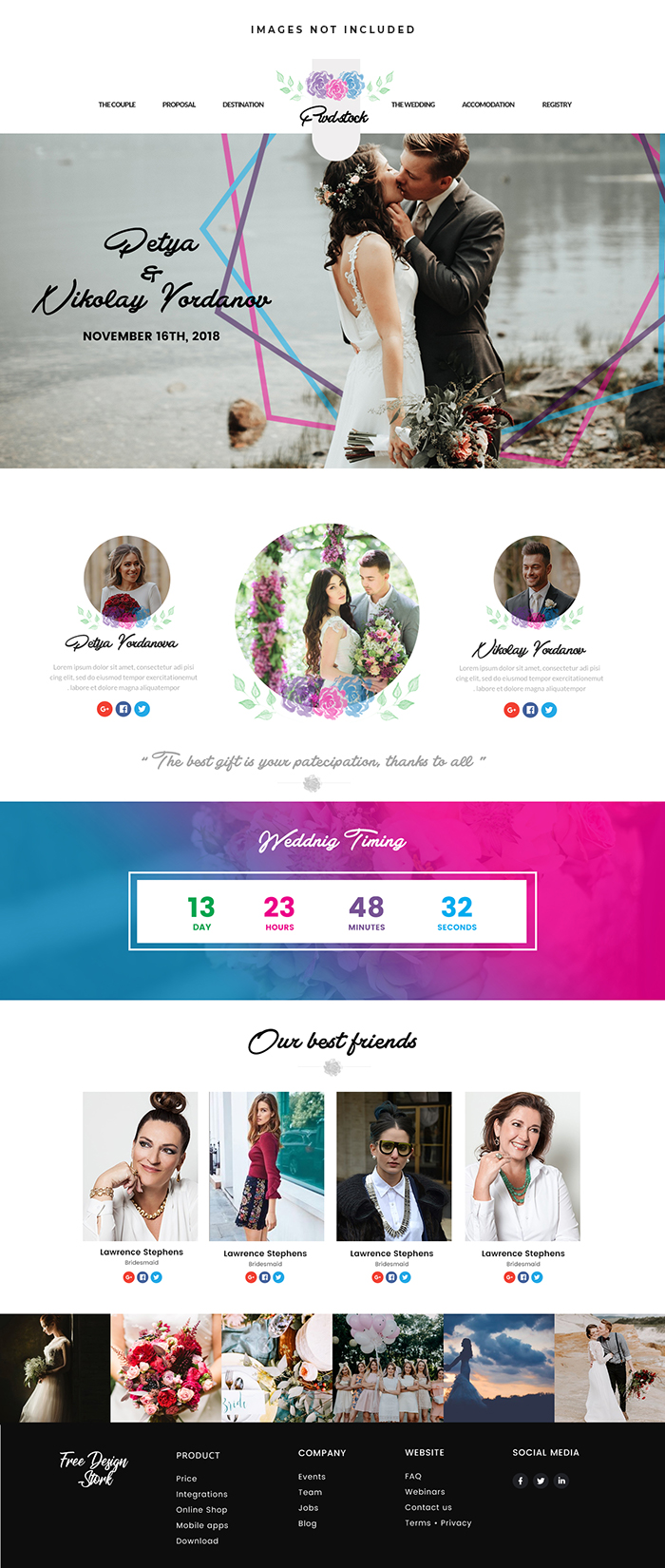
wedding Blog Website
Dowasnload Best Colors Business card layout design
Dowasnload
50% Off on Diamond Skin Care, Nail Art, and Hair Cutting – Exclusive Beauty Sale!
Dowasnload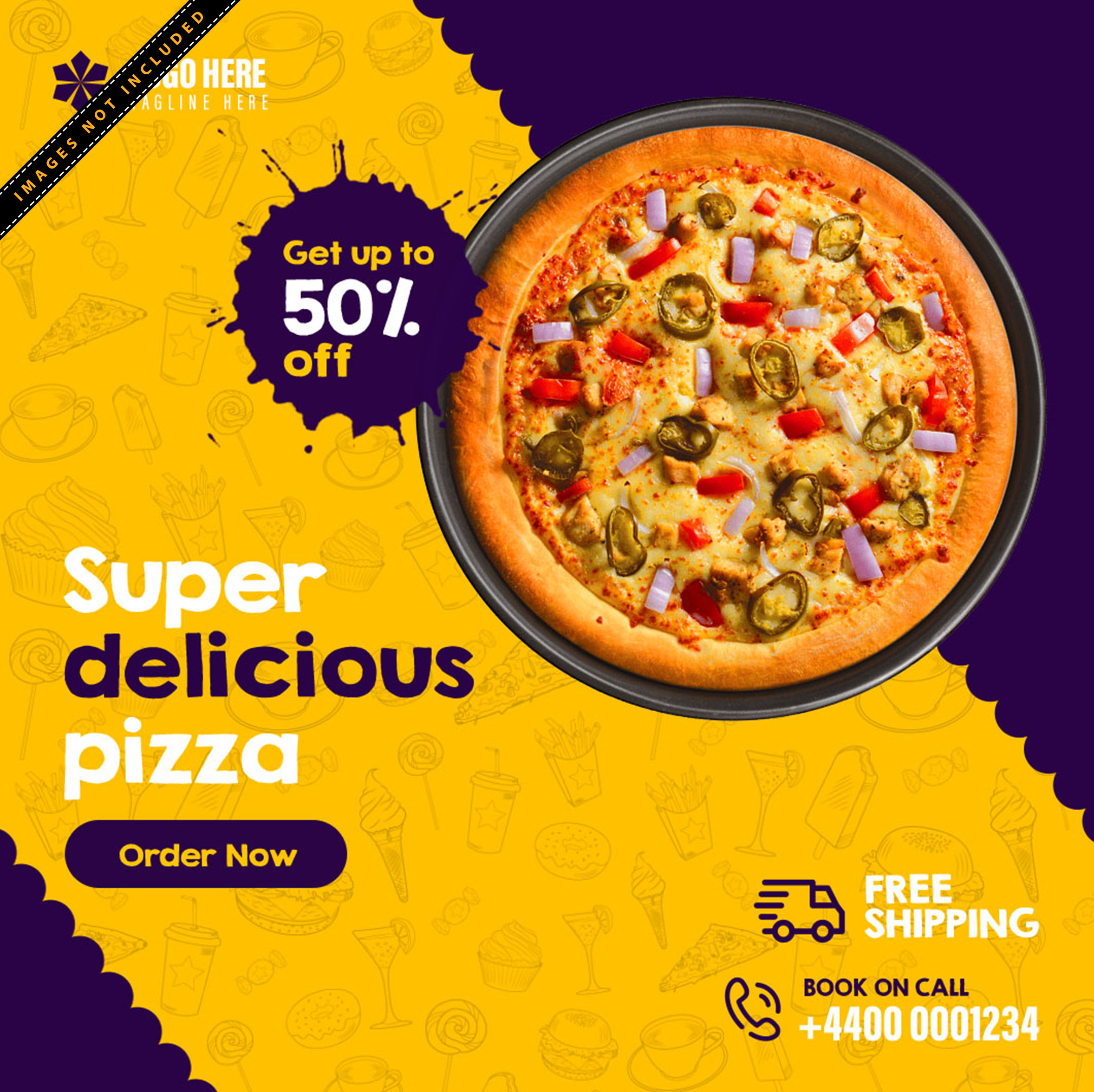
Super Delicious Pizza Post design For social media
Dowasnload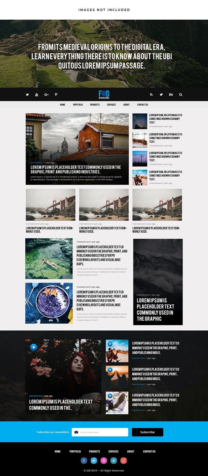
News Blog Website
Dowasnload
Yellow and Black customized business cards
Dowasnload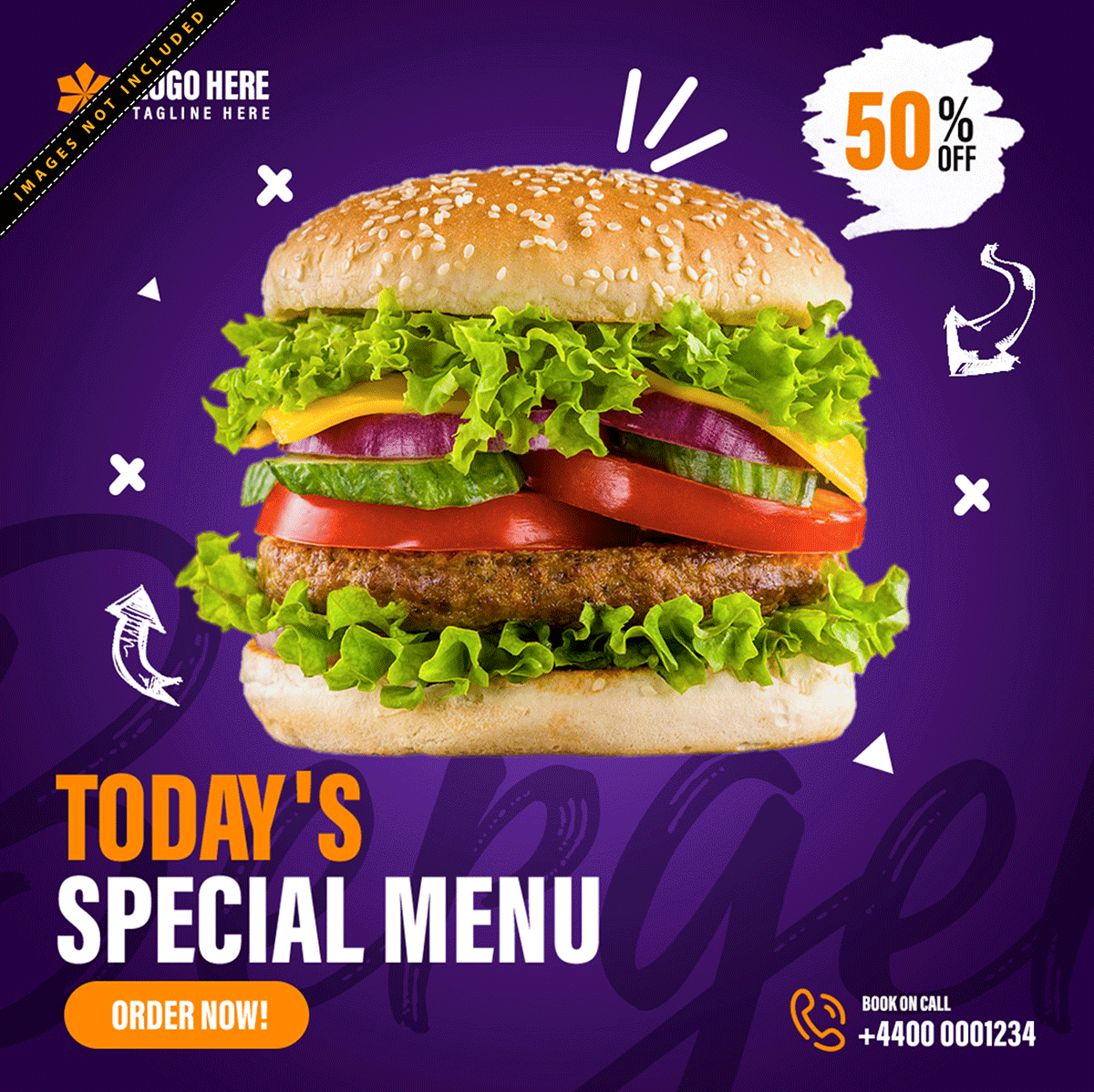
Download Now: Our Free Food Post Design is a Culinary Delight
Dowasnload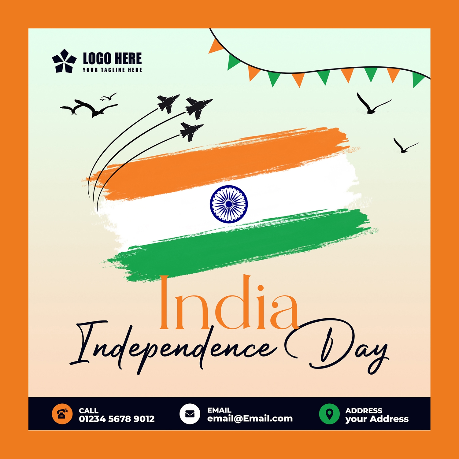
Indian Independence Day Graphic Post
Dowasnload
Luxury Beauty Salon Flyer – Haircuts, Nail Art & Makeup Services Promotion
Dowasnload
Fashion Post Design For Social Media Marketing
Dowasnload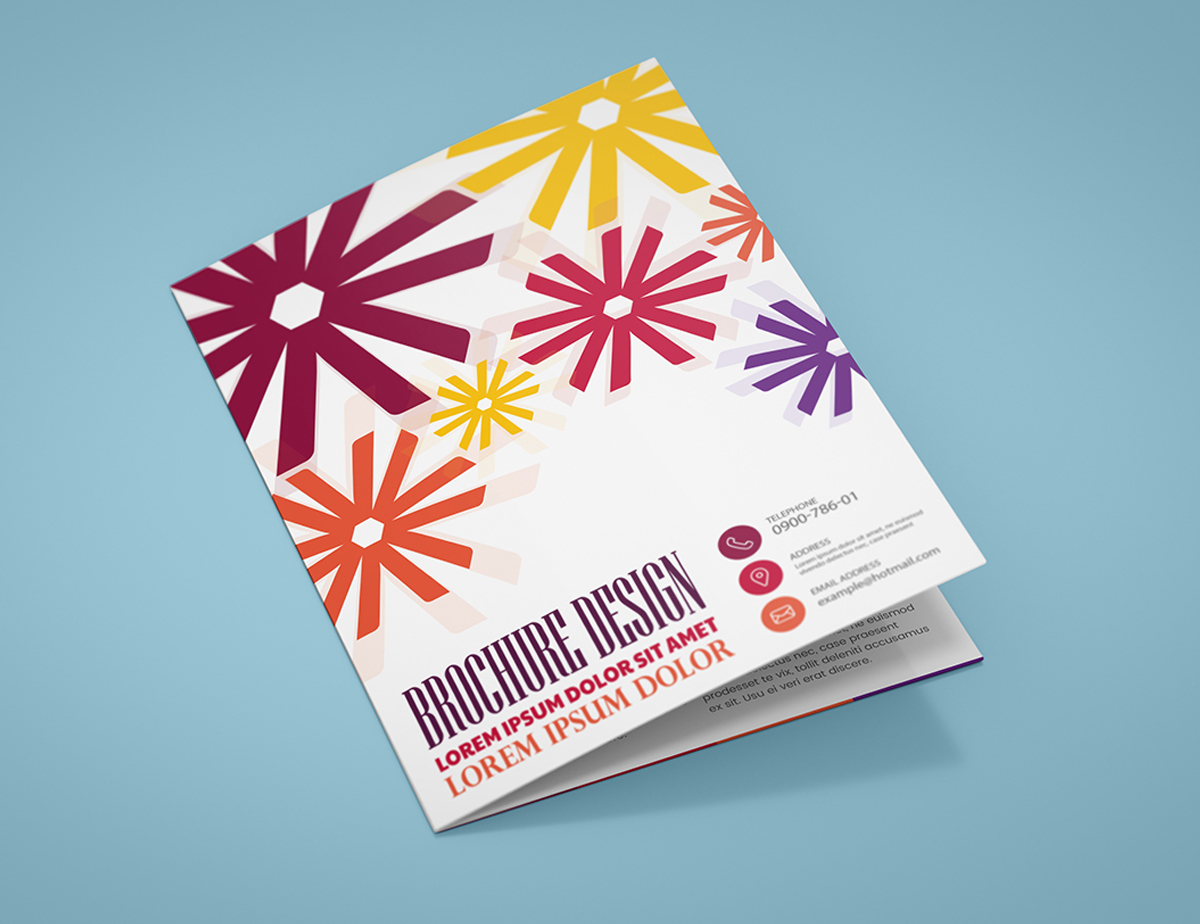
Colorful Business Flyer Design
DowasnloadFree for more insights
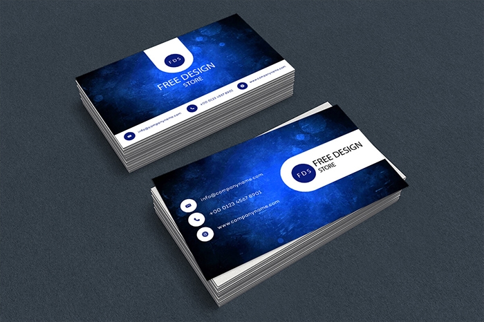
Best Colors Business card layout design
Our professional designer understand the significance of color in business card design. When you choosing our services you gain access to a team of experts who can created a custom layout design that not only incorporates the best colors for your brands but also effectively showcases your brand identity. We work close with you to understand your business your target audience and your design preferences ensuring that the colors chosen resonate with your brands values and message.
Colors have psychological and emotional effect on people, and this knowledge is crucial in designing an effective business card. For example blue is often associated with trust, professionalism and reliability making it a popular choice in the corporate world. On the other hand, red is energetic and attention-grabbing, symbolizing passion and excitemented. Each color has its unique connotations and choose the right combination can influence how your brands is perceived.
Your business card is often the first pointed of physical contact a potential client or partner has with your brand. The color palette you choose can make a significant difference in the first impression your card leaves. A visually appealing and well-coordinated color scheme immediately captures attention, showcasing your brand in a positive light and setting the tone for futured interactions.
X
Online graphic design doesn’t have to be complicated. Start by exploring the collection of trendy templates selected for you by professional designers. Choose and customize right away.