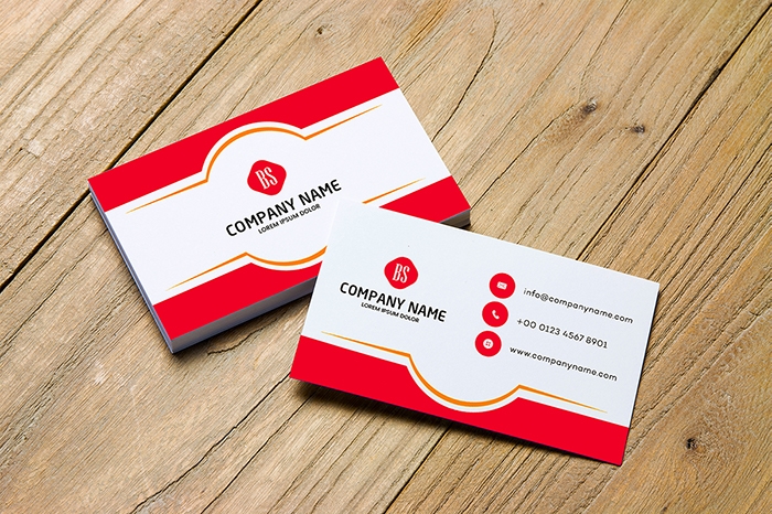
Minimal business card design
More free Designs to download
Nike Logo
DowasnloadFlyer Design purple and yellow
DowasnloadAlphabet Logo design free download
DowasnloadMulti Color Flyer Design
DowasnloadHealthy care life logo design
DowasnloadSuper Delicious Burger Post Design Free Download
DowasnloadBusiness Meeting Logo Design
DowasnloadFood Post Design For Social Media Marketing
DowasnloadHosting Logo Design
Dowasnload25th December Quad E Azam Day Luxury Post Design
DowasnloadVintage business card design
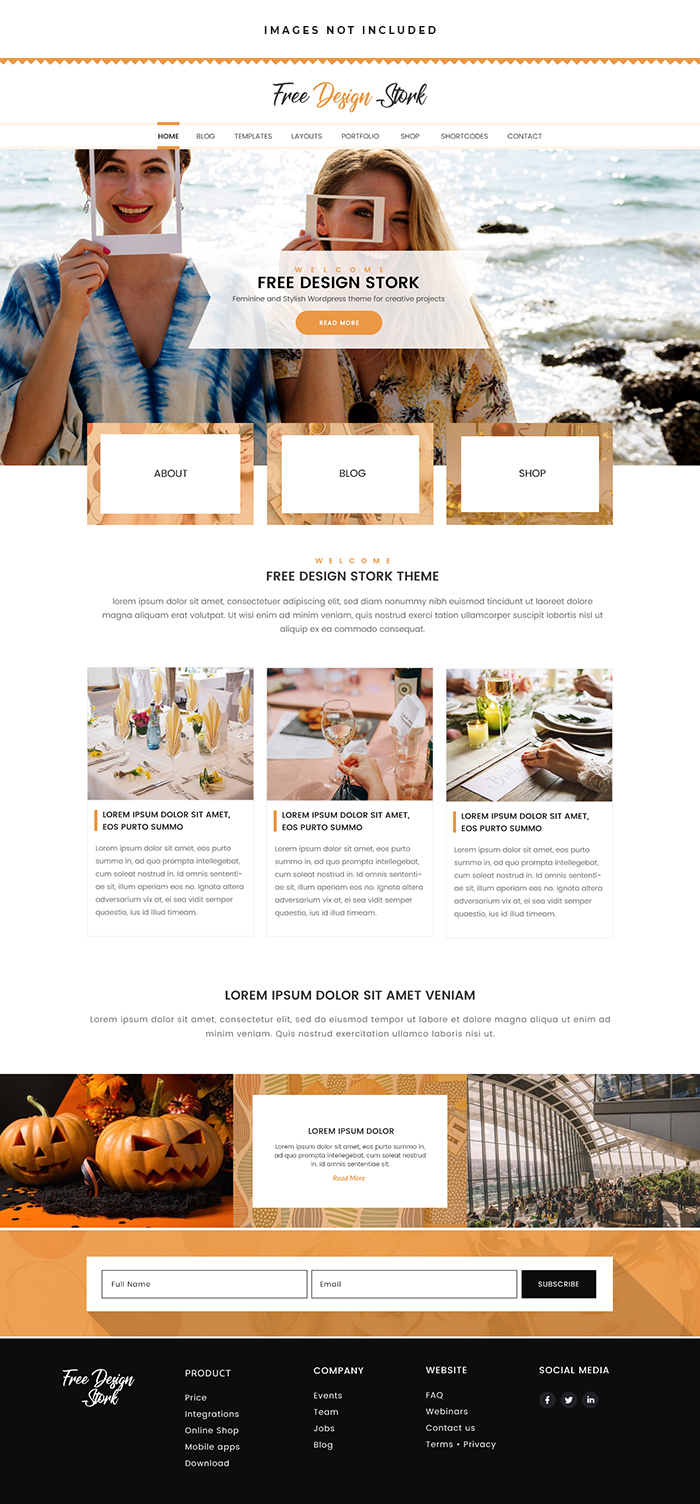
DowasnloadTrip Blog Website
DowasnloadFree for more insights
Minimalist Business Card Design template
Introduction:
In The Realm Of Modern Business Where First Impressions Are Paramount The Humble Business Card Remains An Enduring Symbol Of Professionalism And Connectivity. However In A World Inundated With Visual Noise The Minimalist Approach To Business Card Design Emerges As A Beacon Of Elegance And Effectiveness. In This Comprehensive Exploration We Delve Into The Art And Allure Of Minimalist Business Card Design Uncovering Its Principles Advantages And Timeless Appeal.

Understanding Minimalism In Business Card Design:
Minimalism Transcends Mere Aesthetics; It Embodies A Philosophy Of Simplicity Clarity And Purpose. In The Context Of Business Card Design Minimalism Emphasizes The Removal Of Extraneous Elements To Distill The Essence Of The Message. By Employing Clean Lines Ample White Space And Restrained Typography Minimalist Business Cards Convey Professionalism Sophistication And Attention To Detail.
Key Elements Of Minimalist Business Card Design:
Clean Layout:
The Foundation Of Minimalist Business Card Design Lies In A Clean And Uncluttered Layout. Embrace Simplicity By Allowing Each Element To Breathe Creating A Sense Of Balance And Harmony On The Card.
Limited Color Palette:
Minimalist Business Cards Often Feature A Limited Color Palette Favoring Neutral Tones Such As Black White Gray And Muted Hues. Subtle Variations In Color Can Add Depth And Sophistication To The Design Without Overwhelming The Senses.
Simple Typography:
Choose Clean And Legible Typefaces That Reflect The Personality Of Your Brand. Sans-Serif Fonts Are Favored For Their Modern And Minimalist Aesthetic While Variations In Font Weight And Size Can Create Visual Hierarchy And Emphasis.
Essential Information Only:
Resist The Temptation To Overcrowd Your Business Card With Unnecessary Details. Include Only Essential Information Such As Your Name Title Company Name Contact Information And Perhaps A Brief Tagline Or Website Url.
Strategic Use Of White Space:
White Space Or Negative Space Is A Powerful Tool In Minimalist Design. It Provides Breathing Room For The Eye And Allows Key Elements To Stand Out. Embrace White Space As A Design Element Rather Than A Void To Be Filled.
Minimalist Graphics Or Icons:
Incorporate Minimalist Graphics Or Icons Sparingly To Add Visual Interest And Reinforce Your Brand Identity. Keep Graphics Clean And Purposeful Using Simple Shapes Or Symbols To Convey Meaning Without Cluttering The Design.
Consistency With Branding:
Maintain Consistency With Your Brand Identity By Aligning The Design Of Your Business Card With Other Marketing Materials. Use Consistent Colors Fonts And Imagery To Reinforce Brand Recognition And Create A Cohesive Visual Identity.
Experiment With Texture And Finish:
Explore Different Textures And Finishes To Add Tactile Interest To Your Business Card. Matte Or Satin Finishes Exude A Modern And Refined Aesthetic While Textured Papers Add Depth And Dimension To The Design.
Precision And Attention To Detail:
Pay Meticulous Attention To Detail In Every Aspect Of Your Business Card Design. Ensure That Text Is Aligned Correctly Spacing Is Consistent And Graphics Are Sharp And Well-Defined. Precision Enhances The Overall Professionalism And Impact Of Your Card.
Test And Iterate:
Before Finalizing Your Design Test It Across Different Mediums And Print Formats To Ensure Optimal Legibility And Visual Appeal. Seek Feedback From Colleagues Or Peers And Be Open To Making Revisions Based On Constructive Criticism.
Advantages Of Minimalist Business Card Design:
Professionalism:
Minimalist Business Cards Exude Professionalism And Sophistication. Their Clean And Refined Aesthetic Reflects Positively On Your Brand And Leaves A Memorable Impression On Recipients.
Memorability:
Despite Their Simplicity Minimalist Business Cards Can Be Highly Memorable. A Well-Designed Card That Stands Out From The Crowd Is More Likely To Be Retained And Remembered By Recipients.
Versatility:
Minimalist Business Cards Are Versatile And Adaptable To Various Industries And Professions. Whether You’re A Creative Professional Entrepreneur Or Corporate Executive A Minimalist Design Can Suit A Wide Range Of Contexts And Convey A Polished And Professional Image.
Timelessness:
Minimalist Design Is Timeless And Enduring Transcending Trends And Fads. A Minimalist Business Card Will Remain Relevant And Impactful For Years To Come Ensuring Longevity And Consistency In Your Branding Efforts.
Clarity And Readability:
By Eliminating Clutter And Unnecessary Elements Minimalist Business Cards Prioritize Clarity And Readability. Essential Information Is Easily Accessible Making It Effortless For Recipients To Contact You Or Learn More About Your Services.
Examples Of Minimalist Business Card Designs:
Monochromatic Elegance:
A Black And White Business Card With Clean Typography And Subtle Embossed Accents.
Minimalist Geometric Patterns:
A Business Card Featuring Minimalist Geometric Patterns Or Shapes For A Contemporary And Stylish Look.
Negative Space Emphasis:
A Business Card That Utilizes Negative Space Effectively To Create A Minimalist Yet Impactful Design.
Subtle Texture And Finish:
A Minimalist Business Card With A Matte Finish And Minimalistic Logo Embossing For A Tactile Experience.
Typography-Centric Design:
A Business Card That Relies On Typography As The Main Design Element With Bold Clean Lettering And Minimal Graphics.
In Conclusion:
Minimalist Business Card Design Offers A Timeless And Sophisticated Approach To Branding And Communication. By Embracing Simplicity Clarity And Precision You Can Create Business Cards That Make A Strong Impression While Reflecting The Essence Of Your Brand. Whether You’re Networking At A Conference Meeting With Clients Or Introducing Yourself To Potential Collaborators A Minimalist Business Card Speaks Volumes About Your Professionalism And Attention To Detail. With Attention To Detail And A Commitment To Simplicity You Can Master The Art Of Minimalist Business Card Design And Make A Lasting Impact In Any Business Setting.
X
