Healthy care life logo design

More free Designs to download
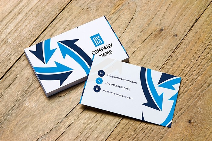
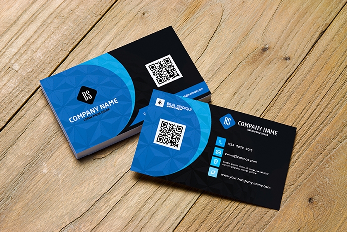
Very Beautiful Creative business cards
Dowasnloadsimple and unique business card design
DowasnloadRed and Blue Personalized business cards
DowasnloadSuper Delicious Food Menu Post Design
DowasnloadBusiness Firm Logo Design
DowasnloadBest Simple business card design
DowasnloadEdgy business card design
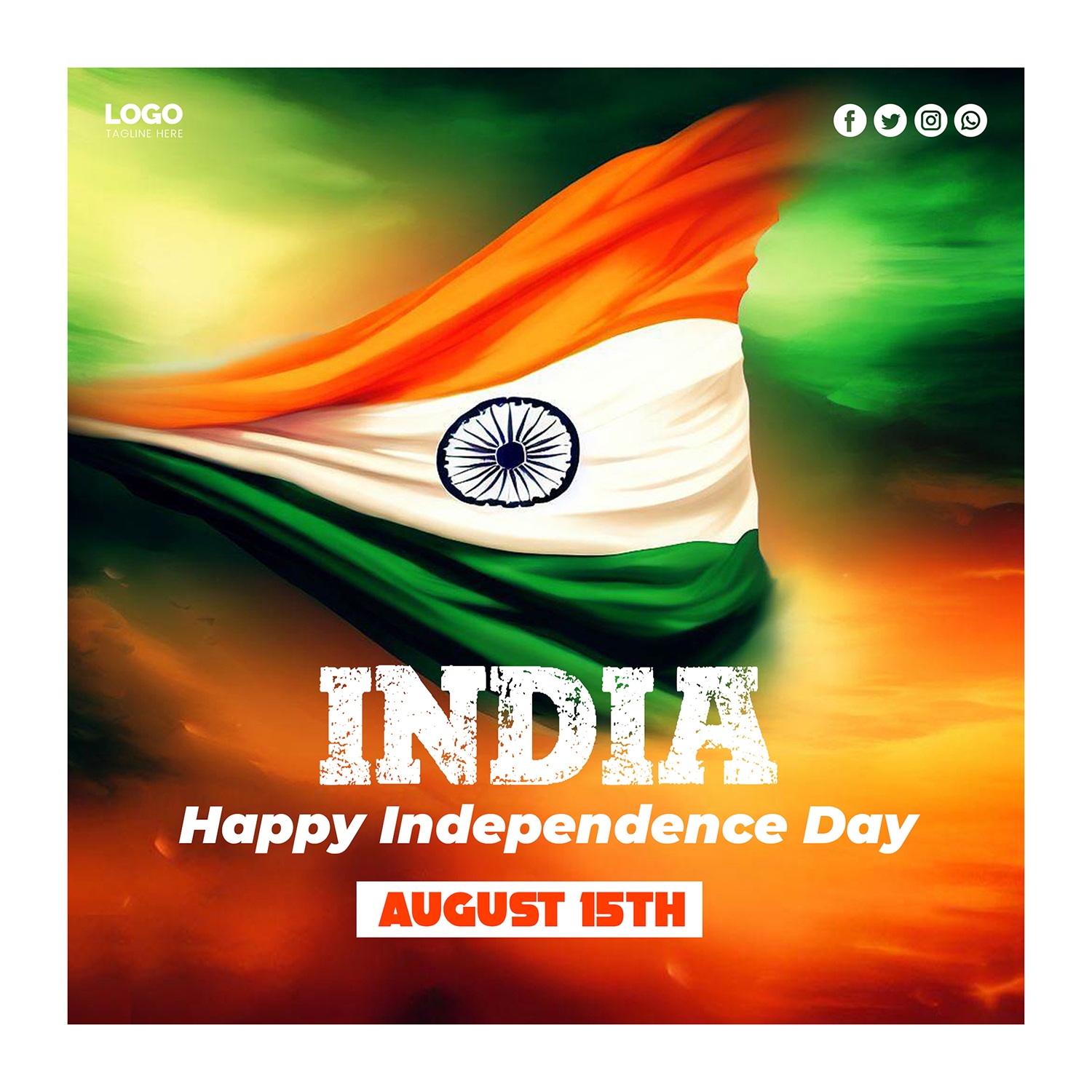
DowasnloadIndian Happy Independence Day Flag Post Design
DowasnloadServices Business card design
DowasnloadColorful Blog Website
DowasnloadSalon logo design
DowasnloadYoga Logo And Business Card Design Free Download Template
DowasnloadFree for more insights
The Healthy Care Life Logo Design Journey
In An Age Where Health And Well-Being Have Become Paramount The Logo Of Healthy Care Life Stands As A Beacon Of Vitality And Promise. It’s Not Just A Symbol; It’s A Testament To The Brand’s Commitment To Nurturing Wellness In All Its Forms. In This Exploration We Embark On The Journey Of Designing The Healthy Care Life Logo Unraveling Its Significance And The Thought Process Behind Each Element.
Understanding Healthy Care Life: A Holistic Approach To Wellness
Healthy Care Life Isn’t Merely A Brand—It’s A Philosophy A Way Of Life. Rooted In The Belief That True Wellness Encompasses Physical Mental And Emotional Health Healthy Care Life Endeavors To Empower Individuals To Lead Their Best Lives. From Nutrition And Fitness To Mindfulness And Self-Care Healthy Care Life Offers A Holistic Approach To Well-Being Guiding Individuals On A Transformative Journey Toward Optimal Health.
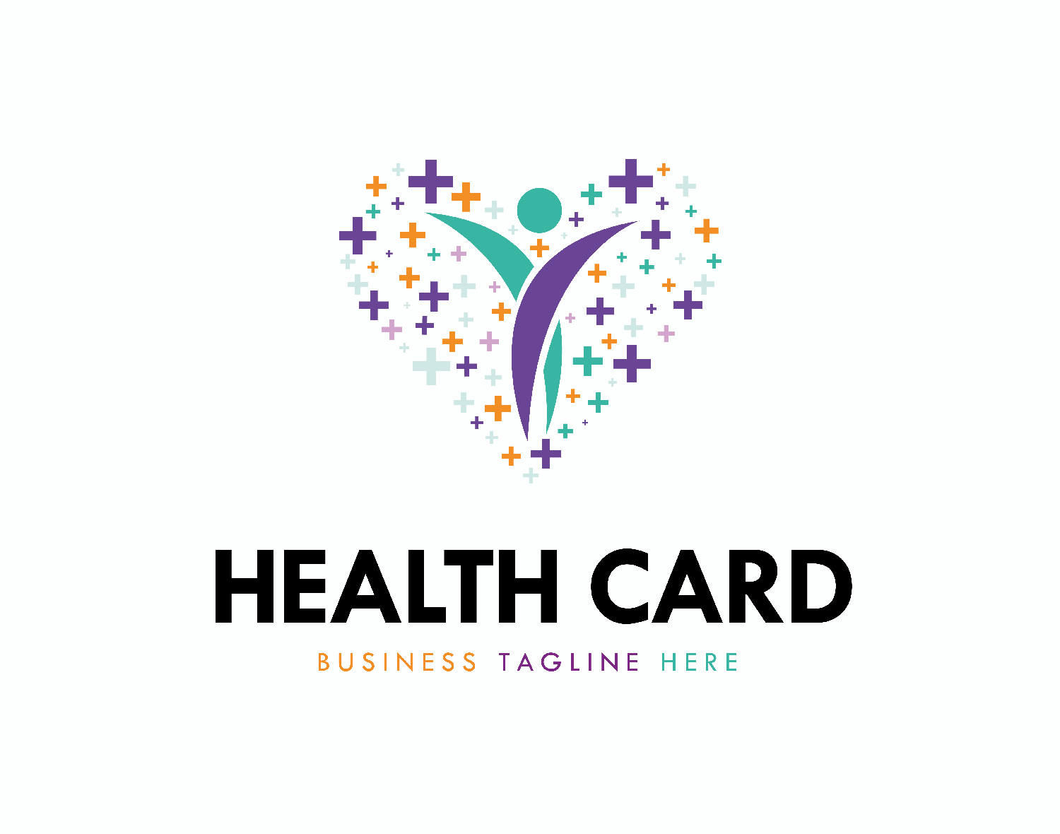
The Symbolism Of The Logo Design
A Logo Is More Than Just A Visual Identifier; It’s A Representation Of A Brand’s Ethos And Values. For Healthy Care Life The Logo Serves As A Visual Embodiment Of Its Core Principles: Vitality Balance And Care. Each Design Element Is Carefully Chosen To Reflect These Values And Resonate With The Brand’s Audience:
Iconography:
The Iconography Of The Healthy Care Life Logo Is Intended To Evoke Feelings Of Health Vitality And Positivity. Symbols Such As Leaves Hearts Or Abstract Shapes Suggestive Of Growth And Renewal Are Employed To Convey The Brand’s Focus On Holistic Well-Being.
Color Palette:
Colors Play A Crucial Role In Conveying Emotions And Associations. For Healthy Care Life A Vibrant Yet Harmonious Color Palette Is Essential. Shades Of Green Symbolize Growth Harmony And Nature While Blues Evoke Trust Stability And Calmness. Accents Of Warm Colors Like Orange Or Yellow Add Energy And Enthusiasm Reflecting The Brand’s Dynamic Approach To Wellness.
Typography:
The Typography Chosen For The Healthy Care Life Logo Is Clean Modern And Easily Legible. Sans-Serif Fonts Are Preferred For Their Contemporary Feel And Readability While Script Fonts Can Add A Touch Of Elegance And Warmth. The Typography Complements The Overall Design Of The Logo And Reinforces The Brand’s Approachability And Professionalism.
Examples Of Effective Healthy Care Life Logos
Let’s Explore Some Hypothetical Examples Of Healthy Care Life Logos:
Vitality Emblem:
This Logo Features A Stylized Leaf Icon Intertwined With A Heart Symbolizing The Interconnectedness Of Physical And Emotional Well-Being. The Vibrant Green Color Palette Conveys Growth Vitality And Nature While Accents Of Orange Add Warmth And Energy.
Harmony Symbol:
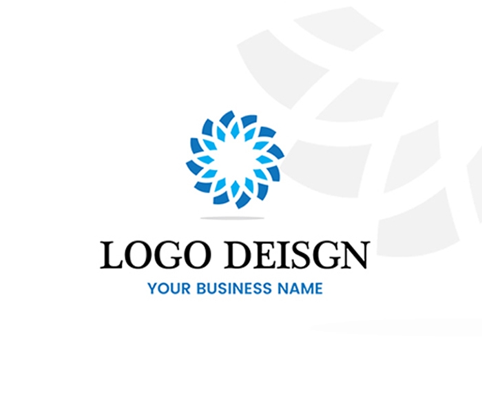
In This Logo A Circular Emblem Incorporating Elements Of Nature And Wellness Represents Balance And Harmony. Shades Of Blue Evoke A Sense Of Calmness And Trust While Greens Signify Growth And Renewal Reflecting The Brand’s Holistic Approach To Wellness.
Dynamic Badge:
This Logo Comprises A Dynamic Composition Of Geometric Shapes And Vibrant Colors Symbolizing Energy Movement And Vitality. The Bold Typography Adds A Modern Touch While The Use Of Contrasting Colors Creates Visual Interest And Impact.
Conclusion: A Symbol Of Well-Being
In Conclusion The Design Of The Healthy Care Life Logo Is A Testament To The Brand’s Commitment To Nurturing Wellness In All Its Forms. By Thoughtfully Selecting Design Elements That Embody Vitality Balance And Care The Logo Serves As A Powerful Symbol Of Inspiration And Empowerment. With Its Harmonious Blend Of Iconography Color Palette And Typography The Healthy Care Life Logo Encapsulates Not Just A Brand But A Way Of Life—One That Embraces Wellness In Its Entirety.
X


