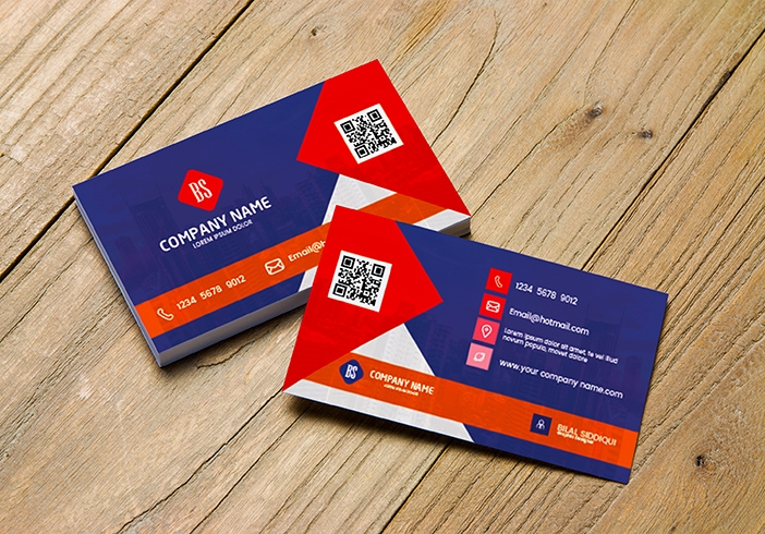
Unique Red and White Business card printing

More free Designs to download
Burger Post Design For Social Media
DowasnloadImran khan poster design
DowasnloadServices Selling Flyer Design
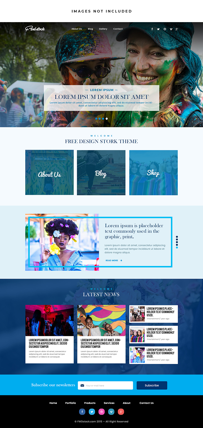
DowasnloadColorful Blog Website
DowasnloadFacebook Logo Design for social media marketing
DowasnloadFood Space Logo Design
DowasnloadTrekking Logo Design
Dowasnloadunique Business Logo Design
DowasnloadMobile Store Logo Design
DowasnloadMountain Jeep Logo Design
DowasnloadServices Logo Design
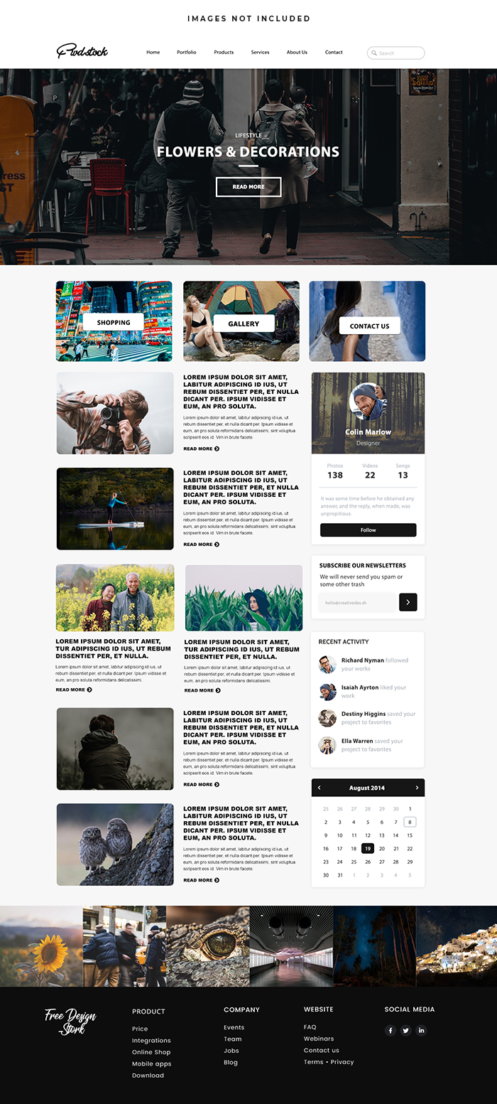
DowasnloadPersonal Blog Website
DowasnloadFree for more insights
Crafting A Unique Red And White Business Card
In The Dynamic Realm Of Business Networking A Distinctive Red And White Business Card Can Serve As A Powerful Tool For Making Memorable Connections And Leaving A Lasting Impression. This Guide Explores Essential Elements And Creative Strategies For Designing And Printing A Unique Red And White Business Card That Captures Attention Communicates Your Brand Identity And Fosters Meaningful Professional Relationships.
Understanding The Impact Of Color
Color Plays A Pivotal Role In Branding And Marketing Evoking Emotions Conveying Messages And Influencing Perceptions. Red And White When Combined Create A Striking Contrast That Commands Attention And Communicates Energy Passion And Sophistication. By Leveraging The Power Of Color Psychology You Can Design A Business Card That Resonates With Your Target Audience And Sets You Apart In A Competitive Landscape.
Key Elements Of Red And White Business Card Design
Balance And Contrast:
Achieve Balance And Contrast By Strategically Combining Red And White Elements In Your Business Card Design. Experiment With Different Layouts Compositions And Proportions To Create Visual Interest While Maintaining Clarity And Readability. Use Red As The Dominant Color For Key Elements Such As Headlines Logos Or Accents While White Serves As A Neutral Background That Enhances Legibility And Contrast.
Typography And Hierarchy:
Select Fonts And Typography That Complement The Overall Aesthetic And Personality Of Your Brand. Choose Legible Typefaces For Essential Information Such As Your Name Job Title And Contact Details. Experiment With Font Weights Sizes And Styles To Create Hierarchy And Emphasis Ensuring That Key Elements Stand Out Prominently Against The Background.
Branding Elements:
Incorporate Consistent Branding Elements Such As Your Logo Color Palette And Visual Identity Into The Design Of Your Business Card. Ensure That Your Logo Is Displayed Prominently And Legibly Serving As A Visual Anchor That Reinforces Brand Recognition And Identity. Use Consistent Typography And Imagery To Maintain Coherence With Your Overall Brand Aesthetic.
Creative Use Of Red And White:
Explore Creative Ways To Integrate Red And White Elements Into Your Business Card Design Beyond Traditional Color Blocking. Experiment With Gradients Patterns Textures Or Overlays To Add Depth And Dimension To Your Design. Consider Incorporating Minimalist Illustrations Icons Or Motifs That Reflect Your Industry Niche Or Brand Personality.
Print Finishes And Techniques:
Enhance The Visual Impact Of Your Red And White Business Card Through Innovative Print Finishes And Techniques. Consider Options Such As Spot UV Coating Foil Stamping Embossing Or Die-Cutting To Add Texture Shine And Dimension To Your Design. Choose Premium-Quality Paper Stocks Or Specialty Finishes That Convey A Sense Of Luxury And Professionalism.
Creative Strategies For Red And White Business Card Printing
Layered Design Elements:
Create Visual Depth And Dimension By Layering Red And White Design Elements To Add Visual Interest And Complexity. Experiment With Overlapping Shapes Text Or Graphics To Create Dynamic Compositions That Engage The Viewer And Invite Exploration. Use Transparency And Opacity Effects To Create Subtle Transitions And Transitions Between Red And White Elements.
Negative Space And Simplicity:
Embrace Negative Space As A Design Element To Create Breathing Room And Visual Clarity In Your Business Card Design. Allow Elements To Breathe And Interact Within The Layout Avoiding Clutter Or Overcrowding That Can Detract From The Overall Impact. Use Negative Space Strategically To Guide The Viewer’s Eye And Highlight Key Focal Points.
Iconic Imagery And Symbols:
Incorporate Iconic Imagery Or Symbols That Resonate With Your Industry Niche Or Target Audience. Choose Symbols That Convey Energy Vitality And Forward-Thinking Such As Arrows Geometric Shapes Or Abstract Patterns. Use Imagery Sparingly To Maintain Focus And Clarity In Your Business Card Design Ensuring That Each Element Serves A Purpose And Reinforces Your Brand Message.
Customization And Personalization:
Add Personalized Touches To Your Red And White Business Card Design To Create A Memorable And Distinctive Impression. Incorporate Hand-Lettered Elements Custom Illustrations Or Unique Graphics That Reflect Your Personality Values And Brand Identity. Personalization Creates A Sense Of Authenticity And Connection That Resonates With Recipients And Fosters Meaningful Relationships.
Feedback And Iteration:
Seek Feedback From Colleagues Mentors Or Industry Peers During The Design Process To Gather Insights And Perspectives. Iteratively Refine Your Business Card Design Based On Constructive Criticism And User Testing Optimizing Elements For Clarity Impact And Effectiveness. Continuously Iterate And Evolve Your Design To Align With Changing Business Needs And Audience Preferences.
Conclusion
Designing And Printing A Unique Red And White Business Card Requires A Thoughtful Blend Of Creativity Strategy And Attention To Detail. By Embracing Color Psychology Leveraging Contrast And Typography Effectively And Incorporating Creative Strategies That Enhance Visual Appeal And Functionality You Can Create A Business Card That Makes A Memorable Impression And Drives Meaningful Connections. Infuse Your Design With Energy Sophistication And Personality Making Your Red And White Business Card A Powerful Representation Of Your Brand Identity And Values In The Competitive Landscape Of Business Networking.
X


