Eye Catching Green And White Business Card

More free Designs to download
Blue And White Business Card Design Templates
DowasnloadSalon logo design
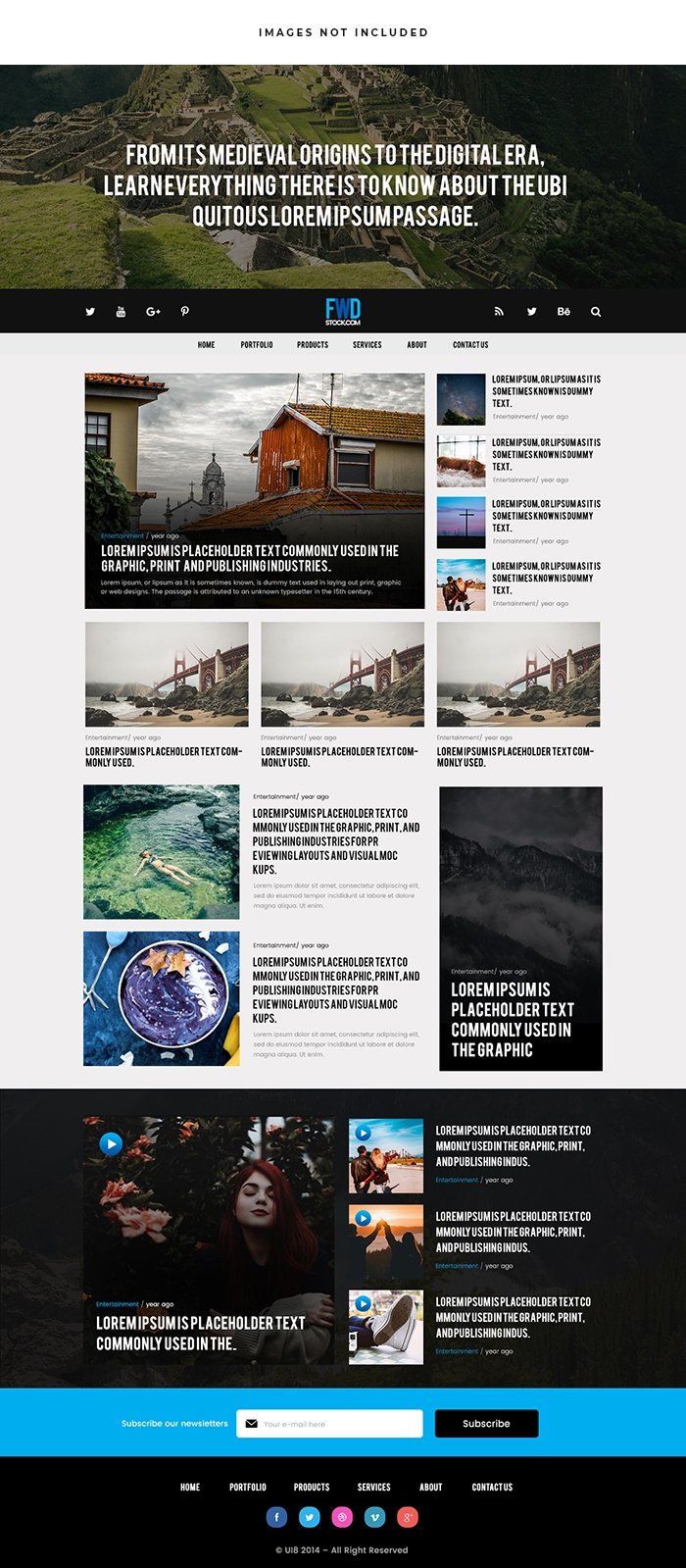
DowasnloadNews Blog Website
DowasnloadMusic Flyer Design
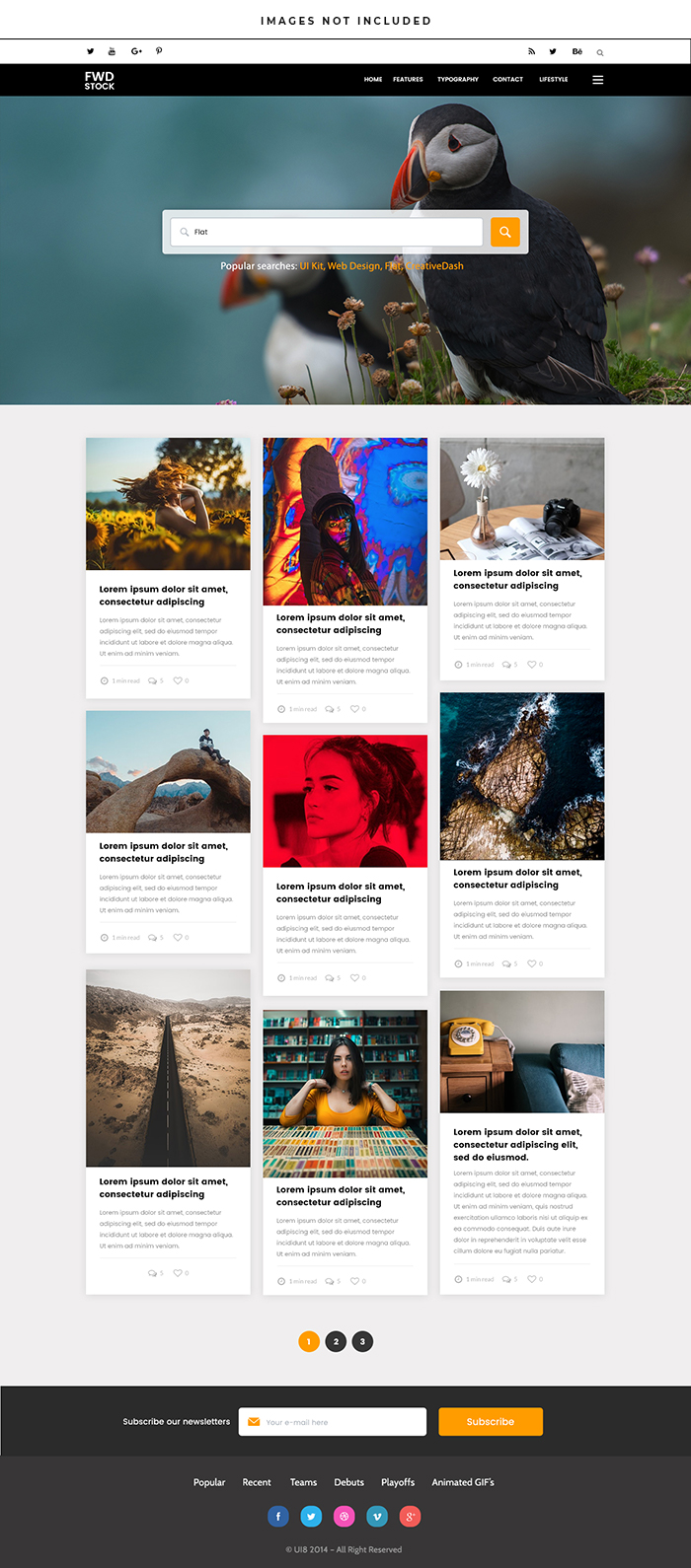
DowasnloadBirds Blog Website
DowasnloadEye-Catching Lines Business Card Design
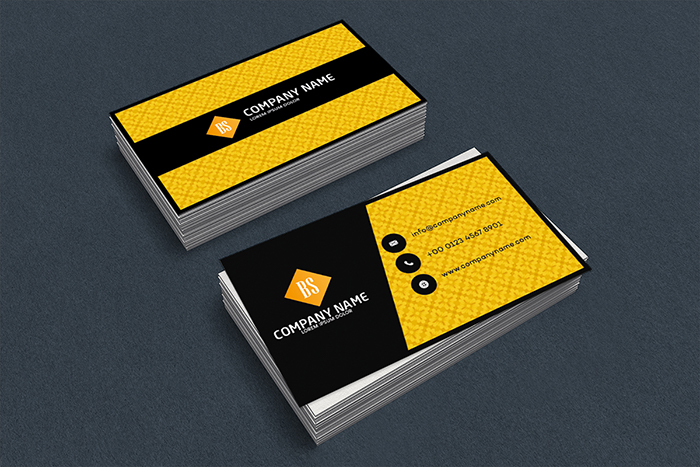
DowasnloadBold Services Business Card Design
DowasnloadUrban business card design
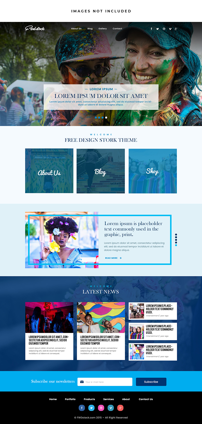
DowasnloadColorful Blog Website
DowasnloadOrganic business card design
DowasnloadNatural business card design
DowasnloadPlumber Logo Design
DowasnloadFree for more insights
Designing An Eye-Catching Green And White Business Card
Introduction:
Green And White Are Refreshing And Vibrant Colors That Evoke Feelings Of Growth Balance And Harmony. When Combined Effectively They Can Create A Striking And Memorable Visual Impact On Your Business Card. In This Guide We’ll Explore Key Design Elements And Strategies For Creating An Eye-Catching Green And White Business Card That Reflects Your Brand Identity And Captures Attention.

Choose The Right Shade Of Green:
Green Encompasses A Wide Spectrum Of Hues From Vibrant Lime Green To Deep Forest Green. Select A Shade Of Green That Resonates With Your Brand Personality And Complements Your Overall Design Aesthetic. Consider The Following Options:
Lime Green: Bright And Energetic Perfect For Modern And Dynamic Brands.
Emerald Green: Rich And Luxurious Ideal For Upscale And Sophisticated Brands.
Mint Green: Soft And Refreshing Suitable For Health And Wellness-Oriented Brands.
Olive Green: Earthy And Natural Great For Eco-Friendly And Sustainable Brands.
Choose A Shade Of Green That Aligns With Your Brand Values And Appeals To Your Target Audience.
Embrace Minimalist Design:
Keep Your Green And White Business Card Design Clean Simple And Minimalist To Allow The Colors To Shine. Avoid Cluttering The Card With Excessive Text Or Graphics And Focus On Essential Elements Such As Your Logo Name And Contact Information. Use Ample White Space To Create A Sense Of Balance And Sophistication Allowing The Green Accents To Pop Against The Neutral Background.
Highlight Key Information:
Ensure That Important Information Stands Out Clearly On Your Business Card. Use Contrasting Typography Or Typography In Shades Of Green To Draw Attention To Your Name Job Title And Contact Details. Experiment With Different Fonts And Font Weights To Create Visual Hierarchy And Emphasize Critical Information. Consider Using White Text On A Green Background Or Vice Versa For A Bold And Eye-Catching Effect.
Incorporate Green Accents And Patterns:
Introduce Green Accents And Patterns To Add Visual Interest And Depth To Your Business Card Design. Consider Incorporating Green Borders Lines Or Geometric Shapes To Frame Key Elements And Create Visual Flow. Experiment With Green Gradients Or Color Overlays To Create Depth And Dimensionality. Alternatively Integrate Subtle Patterns Such As Stripes Dots Or Foliage-Inspired Motifs To Infuse Personality And Charm Into Your Design.
Experiment With Textures And Finishes:
Enhance The Tactile Experience Of Your Green And White Business Card By Incorporating Textures And Finishes. Consider Using Matte Or Satin Finishes For A Smooth And Elegant Feel Or Opt For Glossy Finishes To Add Shine And Luster To Specific Design Elements. Embossing Or Debossing Techniques Can Create Raised Or Recessed Textures Adding A Tactile Dimension To Your Business Card. Experiment With Different Textures And Finishes To Create A Memorable Sensory Experience For Recipients.
Ensure Brand Consistency:
Maintain Consistency With Your Brand Identity Across All Marketing Materials Including Your Business Card. Use The Same Logo Color Palette And Design Elements That You Use On Your Website Social Media Profiles And Other Marketing Collateral. Consistent Branding Helps Reinforce Brand Recognition And Builds Trust With Your Audience. Ensure That Your Green And White Business Card Reflects The Essence Of Your Brand And Communicates Your Values Effectively.
Conclusion:
Designing An Eye-Catching Green And White Business Card Requires Careful Consideration Of Color Typography Layout And Finishes. By Choosing The Right Shade Of Green Embracing Minimalist Design Principles Highlighting Key Information Incorporating Green Accents And Patterns Experimenting With Textures And Finishes And Ensuring Brand Consistency You Can Create A Business Card That Makes A Lasting Impression And Reinforces Your Brand Identity. With Creativity Attention To Detail And A Focus On Quality Your Green And White Business Card Will Stand Out And Leave A Memorable Impact On Potential Clients Partners And Contacts.
X


