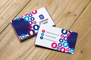
In a world filled with noise and clutter, simplicity stands out. A simple business card design conveys professionalism, sophistication, and attention to detail. By embracing elegant minimalism, you can create a business card that leaves a lasting impression while maintaining clarity and functionality. In this guide, we’ll explore essential elements and strategies for crafting the best simple business card design that resonates with your brand and captivates your audience.
Key Highlights & Fast Facts
- Layout: Prioritize clean, uncluttered spaces with ample white space for balance and readability.
- Typography: Select timeless sans-serif fonts like Helvetica, Arial, or Proxima Nova for a modern aesthetic.
- Color: Stick to a limited palette of one or two complementary colors like black, white, navy, or gray.
- Materials: Invest in high-quality paper stock with matte, satin, or textured finishes to elevate perceived value.
Clean And Uncluttered Layout
The foundation of a simple business card design lies in its clean and uncluttered layout. Opt for a minimalist approach that prioritizes essential information and avoids unnecessary elements. Choose a clean background with ample white space to allow key elements to breathe and stand out. Keep the layout balanced and symmetrical for a polished and professional appearance. A clutter-free layout ensures that your message is clear and easy to digest at a glance.

Choose A Timeless Font
Typography plays a crucial role in the simplicity and elegance of your business card design. Select a timeless font that exudes professionalism and readability. Sans-serif fonts like Helvetica, Arial, or Proxima Nova are popular choices for their clean lines and modern aesthetic. Ensure that the font size is legible and consistent throughout the card, especially for essential details like your name and contact information. A well-chosen font adds a touch of refinement to your business card design.

Never crowd your text. Maintain a safe margin of at least 3mm from the cut edge of your business card to keep critical information perfectly framed and easy to read.
Limited Color Palette
Embrace simplicity by opting for a limited color palette that reflects your brand identity and style. Choose one or two complementary colors that convey professionalism and sophistication. Classic colors like black, white, navy, or gray are timeless and versatile choices for a simple business card design. Use color sparingly to highlight key elements or create visual interest, but avoid overwhelming the card with excessive color. A limited color palette enhances the elegance and coherence of your design.
High-Quality Paper Stock
The choice of paper stock can significantly impact the look and feel of your business card. Opt for high-quality paper stock with a smooth texture and substantial weight that exudes professionalism and durability. Matte or satin finishes are excellent choices for a simple business card design, offering a refined and elegant appearance. Consider adding a subtle texture or embossed logo for tactile appeal. Investing in premium paper stock elevates the perceived value of your business card and leaves a positive impression on recipients.

| Design Element | Recommended Specification |
|---|---|
| Primary Typography | Sans-serif (Helvetica, Arial, Proxima Nova) |
| Color Strategy | 1-2 colors (Black, White, Navy, Gray) |
| Paper Finish | Matte, Satin, or Premium Uncoated |
| Special Finishes | Spot UV, Foil Stamping, Letterpress |
Minimalist Branding Elements
Incorporate minimalist branding elements that reinforce your brand identity and message. Include your logo in a prominent yet understated position, ensuring that it aligns with the overall simplicity of the design. Choose a monochrome or tone-on-tone approach for the logo to maintain visual harmony with the rest of the card. Avoid overcrowding the card with unnecessary branding elements or slogans. A minimalist approach to branding enhances the elegance and clarity of your business card design.

Consider Unique Finishes
While simplicity is key, subtle touches of uniqueness can elevate your business card design and make it memorable. Consider incorporating unique finishes like spot UV coating, foil stamping, or letterpress printing to add depth and sophistication to key elements. Experiment with embossed or debossed details for tactile appeal. These subtle touches of craftsmanship add a tactile and visual dimension to your business card without detracting from its overall simplicity.
- Step 1: Define Essential Content
Include only vital details such as your name, title, company name, phone number, email, and website.
- Step 2: Establish Layout & Whitespace
Arrange your chosen elements using a clean grid with generous negative space to maintain visual balance.
- Step 3: Apply Typography & Color
Incorporate a readable sans-serif font paired with a restricted, elegant two-tone color palette.
- Step 4: Select Finishes & Print
Choose high-grade paper stock and add minimal tactile enhancements like spot UV or a debossed logo.
Conclusion
Crafting the best simple business card design requires a delicate balance of elegance, functionality, and clarity. By focusing on a clean and uncluttered layout, choosing a timeless font, embracing a limited color palette, selecting high-quality paper stock, incorporating minimalist branding elements, and considering unique finishes, you can create a business card that embodies the essence of simplicity and sophistication. With a well-crafted simple business card design, you’ll make a memorable impression on clients, partners, and contacts while conveying professionalism and attention to detail.
What makes a business card design truly minimalist?
A minimalist design relies on generous white space, limited color palettes (typically 1-2 colors), highly legible sans-serif typography, and the omission of unnecessary decorative elements.
Which paper finishes work best for simple designs?
Matte and satin finishes are ideal because they reduce glare, feel sophisticated to the touch, and complement clean typography without distracting the recipient.
Can I use a logo on a minimalist business card?
Yes, your logo is essential. To maintain simplicity, use a monochrome or tone-on-tone version of your logo in a prominent, uncluttered position on the card.