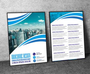
Crafting Your Multi-Colored Business Card Design Introduction: Step Into The Realm Of Contemporary Professionalism With A Multi-Colored Business Card Design That Reflects Your Dynamic Personality And Innovative Spirit. In This Guide We’ll Explore The Art Of Blending Multiple Colors To Create A Modern Eye-Catching Business Card That Sets You Apart From The Crowd. From Vibrant Gradients To Sleek Overlays Let’s Dive Into The World Of Modern Design And Create A Business Card That Makes A Memorable First Impression.
Key Highlights & Fast Facts
- Color Psychology: Understand the emotions and associations evoked by different hues to build a strong brand identity.
- Contemporary Layout: Opt for a clean, minimalist design with ample whitespace to let vibrant colors take center stage.
- Print Preparation: Ensure colors are set to CMYK and important elements stay within safe zones to prevent trimming issues.
Embracing Diversity In Color
Color Psychology: Delve Into The Psychology Of Color To Understand The Emotions And Associations Evoked By Different Hues. Choose A Color Palette That Resonates With Your Brand Identity And Communicates The Desired Message To Your Audience.

Multi-Colored Aesthetics: Experiment With Combinations Of Complementary Analogous Or Contrasting Colors To Create Visual Interest And Impact. Embrace Bold Contrasts Or Subtle Gradients To Convey Creativity Energy And Professionalism.
Design Elements And Composition
Contemporary Layout: Opt For A Clean Minimalist Layout That Allows The Colors To Take Center Stage. Focus On Essential Information Such As Your Name Job Title Contact Details And Logo While Leaving Ample Whitespace For A Modern Uncluttered Look.

Typography: Select Modern And Legible Fonts That Complement Your Design Aesthetic. Experiment With Different Font Weights Styles And Sizes To Create Hierarchy And Visual Appeal.
Graphic Elements: Integrate Geometric Shapes Patterns Or Abstract Graphics To Add Depth And Dimension To Your Business Card Design. Explore Asymmetrical Layouts And Overlapping Elements For A Dynamic And Modern Feel.
When working with vibrant multi-colored palettes, always use high-contrast text to ensure your contact details remain completely legible for all recipients.
Branding And Personalization
Logo Integration: Feature Your Logo Prominently As A Focal Point Of Your Business Card Design. Experiment With Different Placements Sizes And Treatments To Ensure Maximum Visibility And Brand Recognition.

Color Harmony: Maintain Consistency With Your Brand Colors Throughout Your Business Card Design. Use Color Blocking Gradients Or Patterns To Create Visual Cohesion And Reinforce Brand Identity.
Personal Touches: Infuse Your Business Card With Personality By Incorporating Unique Elements Or Details That Reflect Your Individual Style And Values. Consider Adding A Custom Illustration Monogram Or Motivational Quote To Make Your Card Stand Out.
Practical Considerations
Print-Friendly Design: Design Your Business Card With Printability In Mind. Ensure That Colors Are Accurately Represented In Cmyk Format And That Text And Graphics Are Positioned Within The Safe Zone To Avoid Trimming Issues.

Paper Selection: Choose A High-Quality Paper Stock That Enhances The Vibrancy Of Your Colors And Feels Substantial To The Touch. Matte Or Satin Finishes Can Lend A Modern And Sophisticated Look While Textured Papers Add Tactile Interest.
Accessibility: Ensure That Your Contact Information Is Legible And Accessible To Recipients Of Your Business Card. Use Contrasting Colors And Appropriate Font Sizes To Ensure Readability Especially For Individuals With Visual Impairments.
| Feature | Specification |
|---|---|
| Color Mode | CMYK (Print-Ready) |
| Recommended Finishes | Matte, Satin, Spot UV, Foil Stamping, or Embossing |
| Design Focus | Minimalist Layout with High-Contrast Typography |
Printing And Production
Professional Printing Services: Partner With A Reputable Printing Company That Specializes In High-Quality Business Card Printing. Choose A Provider That Offers Customization Options Such As Spot Uv Coating Foil Stamping Or Embossing To Elevate Your Design.
Proofing Process: Review Digital Proofs Carefully Before Finalizing Your Order To Check For Color Accuracy Alignment And Any Potential Printing Errors. Request Physical Samples If Available To Ensure That The Finished Product Meets Your Expectations.
Quantity Planning: Determine The Quantity Of Business Cards You’ll Need Based On Your Networking And Marketing Needs. Consider Ordering A Larger Quantity To Take Advantage Of Bulk Discounts And Ensure You Have An Ample Supply For Future Use.
- Step 1: Choose Your Palette
Delve into color psychology to pick vibrant yet harmonious multi-color combinations that reflect your brand.
- Step 2: Build the Layout
Set up a clean, minimalist canvas with your logo, typography, and geometric or abstract accents.
- Step 3: Prepare for Print
Convert your artwork to CMYK mode, check safe zones, and select a premium paper stock.
- Step 4: Proof & Print
Review physical or digital proofs thoroughly with a professional print partner before mass production.
Conclusion
With Their Vibrant Colors Contemporary Design And Personalized Touches Multi-Colored Business Cards Offer A Modern And Memorable Way To Make A Lasting Impression On Clients Colleagues And Contacts. By Following The Principles Outlined In This Guide And Infusing Your Creativity And Personality Into Your Design You Can Create Business Cards That Not Only Reflect Your Brand Identity But Also Showcase Your Innovative Spirit And Unique Style. So Embrace The Power Of Color Unleash Your Creativity And Get Ready To Make A Bold Statement With Your Multi-Colored Business Card Design.
Why should I use multiple colors in a business card design?
Multi-colored designs reflect a dynamic personality and innovative spirit, helping your brand stand out with vibrant gradients, sleek overlays, and memorable visual contrast.
What color format should I use for printing multi-colored business cards?
Ensure that your colors are accurately represented in CMYK format and that all critical text and graphics remain positioned within the safe zone to avoid trimming issues.