Unique Multiple Blue Color Business Card Design for Your Brand
 VECTOR SOURCE
Asset Overview & Description
Unique Card Design For Your Businesses Introduction
In the realm of business cards, creativity and uniqueness are paramount in making a lasting impression. A multiple blue color business card design offers a perfect blend of sophistication, professionalism, and creativity, making it an ideal choice for individuals and businesses looking to stand out. In this guide, we’ll explore the art of crafting a dynamic and elegant multiple blue color business card design that captivates viewers and reflects your brand identity with style. From color psychology to design elements, let’s delve into the world of vibrant hues and create a business card that leaves a memorable impact.
Key Highlights & Fast Facts
- Color Psychology: Blue symbolizes trust, reliability, and professionalism, while multiple shades add depth and dimension.
- Composition: Focus on clean layouts, gradient effects, and subtle textures to elevate your business card design.
- Practical Print: Ensure your designs are optimized in CMYK format and printed on high-quality paper stock for a luxurious finish.
Understanding the Power of Blue
Blue Color Psychology
Blue is a versatile color that symbolizes trust, reliability, and professionalism. It evokes a sense of calmness and confidence, making it an ideal choice for business card designs. Multiple shades of blue can add depth and dimension to your design, creating visual interest and sophistication.

Color Harmony
Experiment with different shades of blue to create a harmonious color palette for your business card design. Consider combining light and dark blues, as well as variations in saturation and tone, to add richness and complexity to your color scheme.
When working with multiple shades of blue, maintain a high contrast ratio between your typography and background colors to ensure optimal readability for all recipients.
Design Elements and Composition
Clean Layout
Start with a clean and well-organized layout that allows your design elements to shine. Focus on essential information such as your name, job title, contact details, and logo while leaving ample space for the multiple blue colors to make an impact.
Gradient Effects
Incorporate gradient effects to add depth and visual interest to your business card design. Experiment with linear or radial gradients in varying shades of blue to create a dynamic and eye-catching backdrop for your layout.
Texture and Patterns
Introduce texture and patterns into your design to enhance the visual appeal of your business card. Consider using subtle textures or intricate patterns in shades of blue to add tactile interest and sophistication.
| Design Aspect | Specification & Best Practices |
|---|---|
| Color Mode | CMYK for accurate print representation |
| Visual Elements | Gradients, linear/radial fades, subtle blue textures |
| Essential Info | Name, job title, contact details, high-resolution logo |
Branding and Personalization
Logo Integration
Seamlessly integrate your logo into the design, ensuring that it stands out against the backdrop of multiple blue colors. Experiment with different placements and sizes to find the perfect balance between visibility and integration.

Brand Identity
Use your business card design to reinforce your brand identity and values. Consider incorporating elements such as typography, icons, or motifs that reflect your brand’s personality and style.
Personalization
Infuse your business card with personal touches that resonate with your unique identity and story. Whether it’s a custom illustration, a meaningful quote, or a memorable tagline, adding personal elements can make your business card design truly stand out.
Practical Considerations
Print-Friendly Design
Design your business card with printability in mind, ensuring that the multiple blue colors are accurately represented in CMYK format. Pay attention to color saturation and contrast to ensure optimal print quality.
Paper Selection
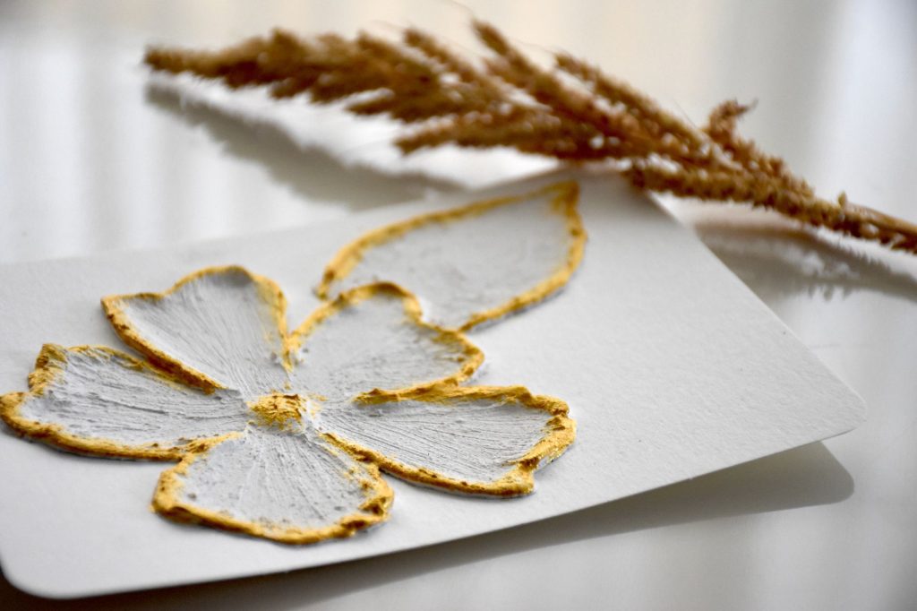
Choose a high-quality paper stock that complements the elegance of your design. Opt for a smooth or textured finish in a weight that feels substantial and luxurious to the touch.
Legibility and Accessibility
Ensure that your contact information is legible and accessible to recipients of your business card. Use a legible font size and contrast to ensure readability, especially for individuals with visual impairments.
Printing and Production
Professional Printing Services
Partner with a reputable printing company that specializes in high-quality business card printing. Choose a provider that offers customization options such as foil stamping, embossing, or spot UV coating to enhance your design.
Proofing Process
Review digital proofs carefully before finalizing your order to check for color accuracy, alignment, and any potential printing errors. Request physical samples if available to ensure that the finished product meets your expectations.
Quantity Planning
Determine the quantity of business cards you’ll need based on your networking and marketing needs. Consider ordering a larger quantity to take advantage of bulk discounts and ensure you have an ample supply for future use.
-
Step 1: Choose Your Color Palette
Select cohesive shades of blue that leverage color psychology to project trust and professionalism.
-
Step 2: Build Your Layout
Incorporate clean typography, subtle gradients, and your brand logo with ample white space.
-
Step 3: Print & Refine
Send your CMYK-ready files to a professional printer, selecting premium paper stock and finishing touches like foil stamping.
Conclusion
Crafting a unique multiple blue color business card design is a creative and rewarding endeavor that allows you to showcase your brand identity with elegance and flair. By experimenting with different shades, gradients, and textures of blue, you can create a business card that captivates viewers and leaves a lasting impression. So let your imagination soar, embrace the power of color, and create a business card that truly stands out in a sea of mediocrity.
Why choose blue for a business card design?
Blue symbolizes trust, reliability, and professionalism, making it a versatile and universally appealing choice for corporate and creative branding alike.
How can I make multiple blue shades look dynamic?
You can add depth and visual interest by utilizing gradient effects, subtle background textures, and varying levels of color saturation.
| File Formats | .AI (Adobe Illustrator), .EPS (Vector), .SVG, .PNG Preview |
|---|---|
| Resolution / Quality | Vector Scalable (Infinite Resolution) • 300 DPI Print Ready |
| Layer Organization | Fully Layered, Organized Groups, Editable Text & Vectors |
| Commercial License | 100% Free Forever (Personal & Commercial) |
| Compatibility | Adobe Illustrator, Photoshop, Figma, CorelDraw, Inkscape, Affinity Designer |


